AI Search Experience
Shaping how AI search fits a car buying journey where most people already know what they want.

Project summary
cinch launched the group's first customer-facing AI experience: a search box where people could describe the car they wanted in their own words. I led design on the next phase, using live test data and customer research to find where people struggled, and coded prototypes built with Claude to make the case for splitting search and filters into two clear routes.
Overview
AI search let customers type what they wanted, such as "automatic SUV under £6,000" or "family friendly", instead of setting filters one by one. Phrases that matched a filter were applied as one; anything else ranked results by how likely each car was to match. The MVP was live in an A/B test, and my job was to find out how people were really using it and what to improve next.

The MVP: an AI search box with no hint of what to type, and results that don't show what the AI understood or how to change it.
Research insights
Earlier research had flagged AI as worth exploring. A later round of in-depth interviews, run by our service designer with my support, reaffirmed it and showed how people search for a car:
Two ways in. Most arrived with a make and model in mind; others started from their needs, like room for two children, a dog and a buggy.
Budget first. Buyers start with what they can afford, then add filters until almost nothing is left.
Needs filters can't capture. Must-haves like rear air vents meant checking listings photo by photo.
AI as an adviser. Buyers already used ChatGPT, Claude and Perplexity to compare models and decode jargon, just not on our site.
AI search could meet need-led buyers in their own words, but it also had to work for the majority who already knew what they wanted.
The problem
That tension showed up in the live test data. Fewer than two-thirds of people who tapped the search box went on to search, use of "Browse all" more than tripled, and most searches were simply a make and model.
People weren't failing to find cars. They were unsure what to type into an AI box, so they went back to the filters they knew. One box was trying to do two jobs.
The data also exposed dead ends: low budgets returned nothing with no explanation, monthly budgets were sorted cheapest first, and some people typed a registration plate to get back to a car they'd seen.

Live test findings: many people who opened the AI search box didn't go on to search, and more turned to the filters they already knew.
My role
I led design on the refinement phase after the MVP, working with product, engineering and data. I owned the analysis of the live test findings, the design response across mobile and desktop, and the prototypes used to align stakeholders.
Approach
Two clear routes
With most searches being a simple make and model, I challenged the idea of making free-text AI the main way to search. Instead, I proposed two clear routes: typing goes in Search, tapping goes in Filters, as two separate buttons linked to each other. The existing "Browse all" now lands on results with filters ready, so people looking for them find them straight away. On results, one row of editable chips shows what the AI understood, so people can see and correct its assumptions.

Wireframe: results show what the AI understood as editable chips, with Search and Filters as separate buttons.
Fixing the dead ends
Zero-result searches get a recovery screen that explains why and offers a way forward. Monthly budgets show cars in a price band, and registration plates take people straight back to the car they saw.

Wireframe: zero results explain why and offer fixes with a car count each, and monthly budgets show a price band instead of the cheapest cars first.
How I used AI
Tools: Claude for research, analysis and coded prototypes; Figma for final UI; analytics for the live test data.
Leading the work, with AI as a working partner
I set the direction and used Claude to get through the legwork faster. I chose what to benchmark, which questions to ask of the test data and how to frame the problem. The decisions stayed mine: I rejected suggestions that added complexity without evidence.
Prototypes that behave like the real product
Search depends on what people type, so a static Figma prototype would need a screen for every query and would still break. Instead I used Claude to build coded prototypes of the whole flow, from homepage to results and edge cases, on mobile and desktop, so a search typed on one screen carried through to the next.
Making the case with something real
Stakeholders could try the Search and Filters split, alongside a side-by-side comparison with the live experience, instead of imagining it from slides. That kept the conversation on evidence rather than opinion. Feedback was applied during reviews, and new edge cases from the data could be prototyped the same day.
Impact
Prototyping time cut from days to hours
More options explored and tested against real edge cases
A working proposal that moved the decision forward faster than static designs
Outcome
The data-led proposal reframed the conversation from "how do we improve the AI box" to "how do people want to find a car". The wider AI search work is now being prioritised for incremental releases, each A/B tested, with the Search and Filters split, editable AI chips and edge-case screens as part of the proposed direction.
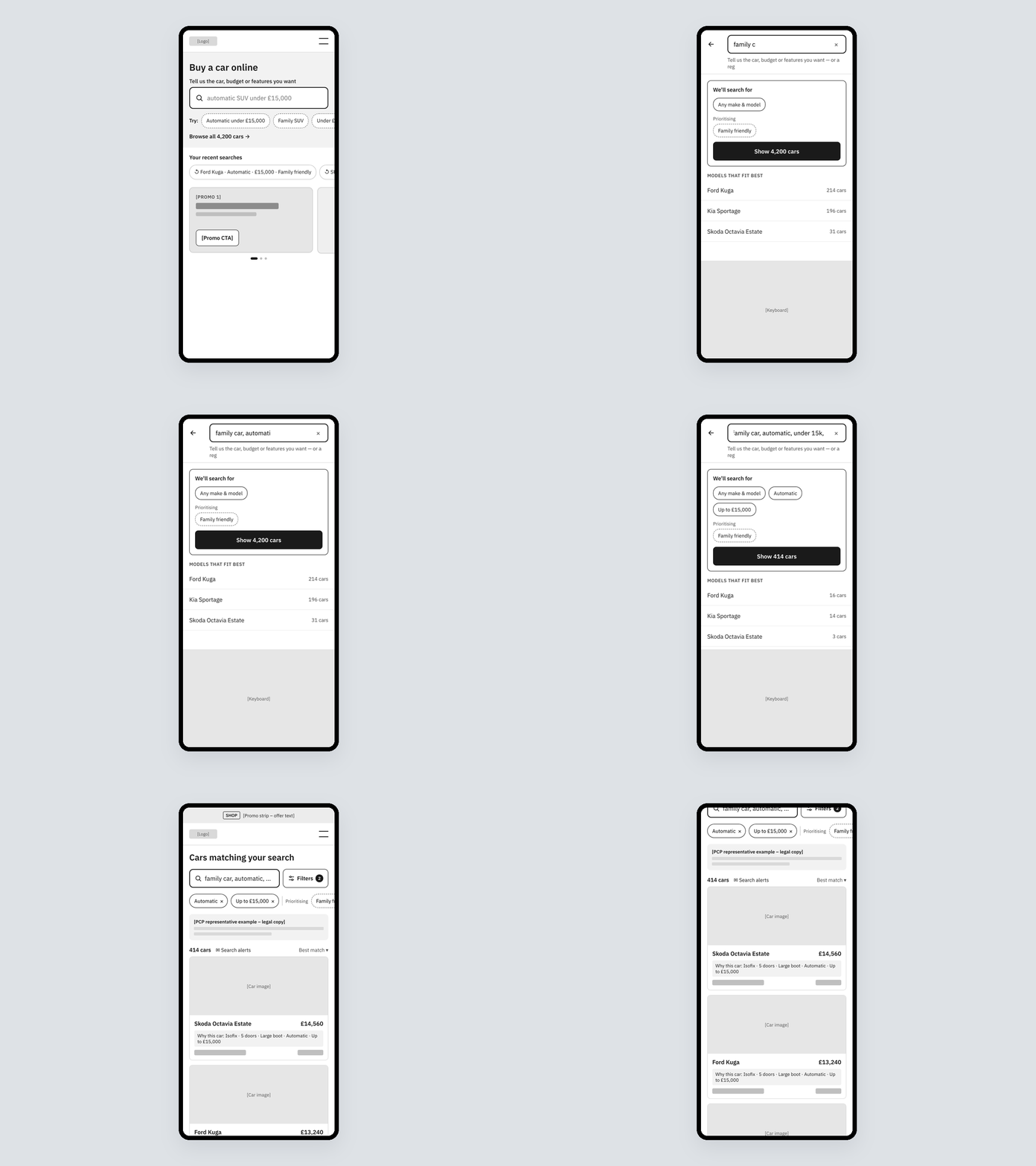
Coded prototype built with Claude: a search typed in plain words is read live into editable chips, then carried through to results.
Key learnings
New technology has to meet people where they already are
Showing what an AI understood, and letting people correct it, builds more trust than hiding it
A working prototype settles debates faster than a deck
What I would do next
Measure each release against a clear goal: search submission first, then progression to car pages and fewer zero-result searches. Longer term, I'd save people's search criteria so returning buyers don't start from scratch, one of the research's own recommendations.

Wireframe: the proposed direction on desktop, with editable AI chips above results and filters always visible alongside.

Before and after: the live MVP homepage on the left, and the proposed direction on the right, with a clear prompt and examples of what to type.

Visual direction: homepage search, and the live preview showing what the AI understood as filters and priorities before results load.
Other projects
Luxury Platform Launch
Launching a premium car buying experience within platform constraints and brand expectations.
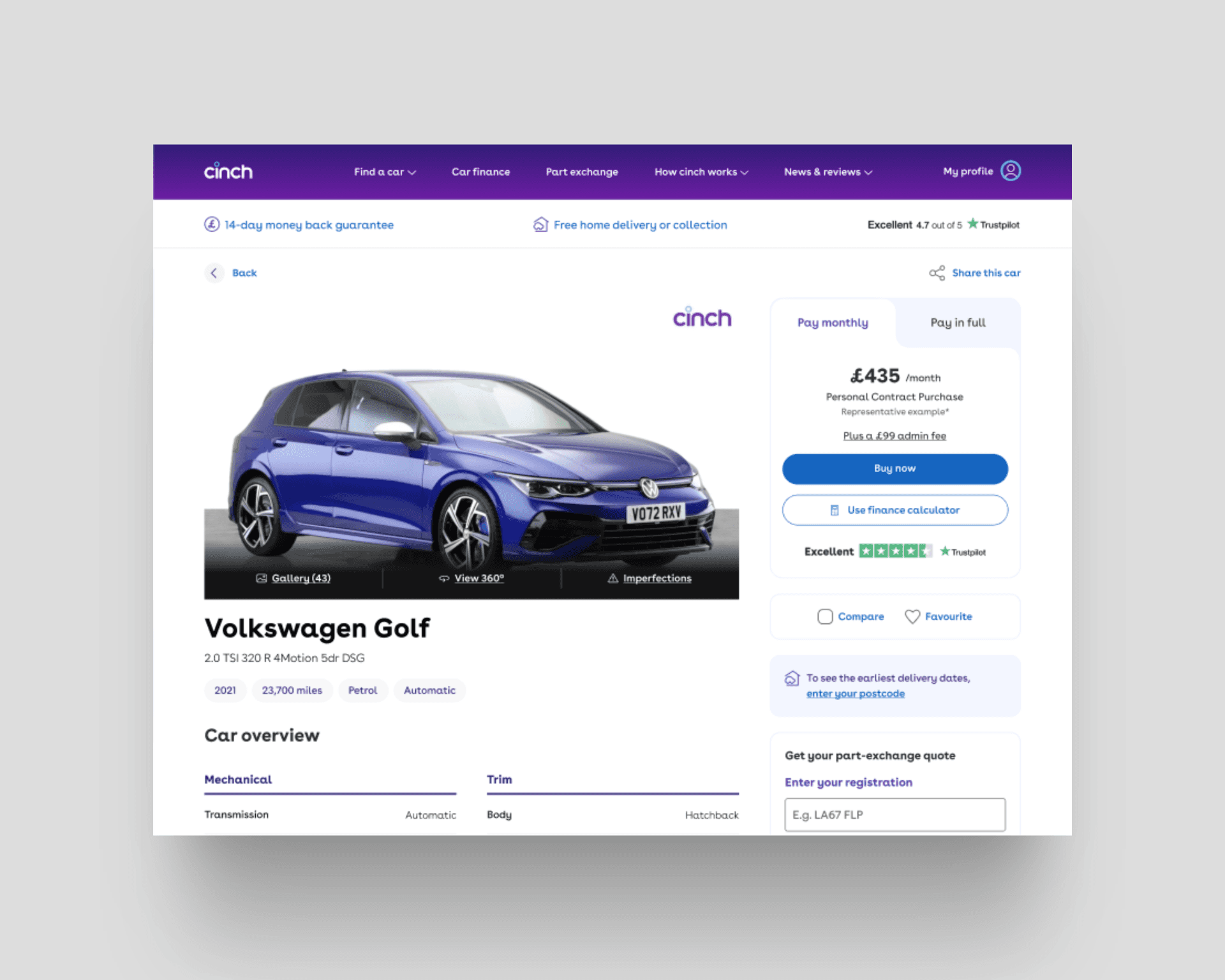
Product Page Optimisation
Improving purchase intent through clearer hierarchy, stronger decision cues, and experimentation.
Design System Alignment
Restoring design and development alignment to improve consistency and delivery efficiency.
EV Experience Optimisation
Reducing EV buyer uncertainty through clearer information, contextual education, and structure.