EV Experience Optimisation
Reducing EV buyer uncertainty through clearer information, contextual education, and structure.
Project summary
Improved electric vehicle product pages to increase conversion intent by making EV information clearer and easier to understand. Led UX enhancements focused on education, decision support, and reducing uncertainty.
Overview
As electric vehicles became a growing part of the catalogue, user behaviour showed strong interest but hesitation around EV specific topics such as charging, range, and ownership considerations. Existing product pages treated EVs similarly to combustion vehicles, leaving gaps in clarity and increasing decision friction. This work supported the company’s push to grow EV adoption by reducing hesitation in a category with high user uncertainty.
The problem
EVs introduce unfamiliar concepts such as charging time, home charging requirements, and real world range. Without clear explanations, users were more likely to hesitate, switch back to non EV options, or leave the journey to research elsewhere. The challenge was to improve understanding without overwhelming users or disrupting the core vehicle evaluation flow.
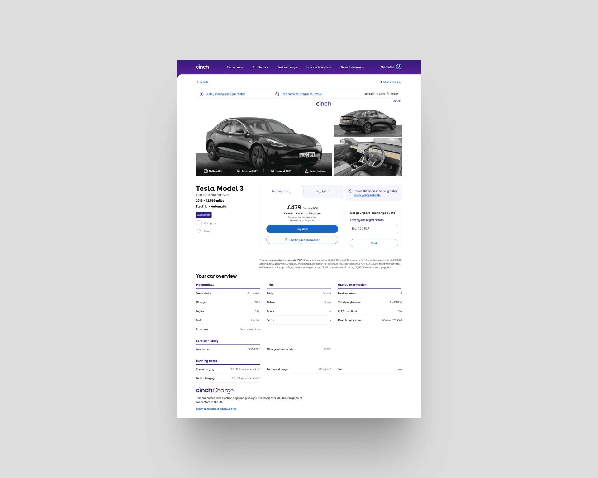
Original PDP layout not optimised for EV’s.
My role
Led UX direction for improving EV product pages, working closely with product and engineering. Responsibilities included identifying EV specific information gaps, restructuring content hierarchy, introducing supporting explanations, and balancing education with conversion focused elements.
Approach
Understanding uncertainty and information gaps
Reviewed user feedback, behavioural patterns, and common themes in customer support queries to identify where EV buyers were getting stuck or losing confidence.

User research highlighted uncertainty about range, charging and cost.
Making EV information scannable and contextual
Restructured page layouts to surface EV range, charging, and efficiency information alongside standard vehicle specs. Added explanatory microcopy and visual cues to make technical information easier to understand at a glance.
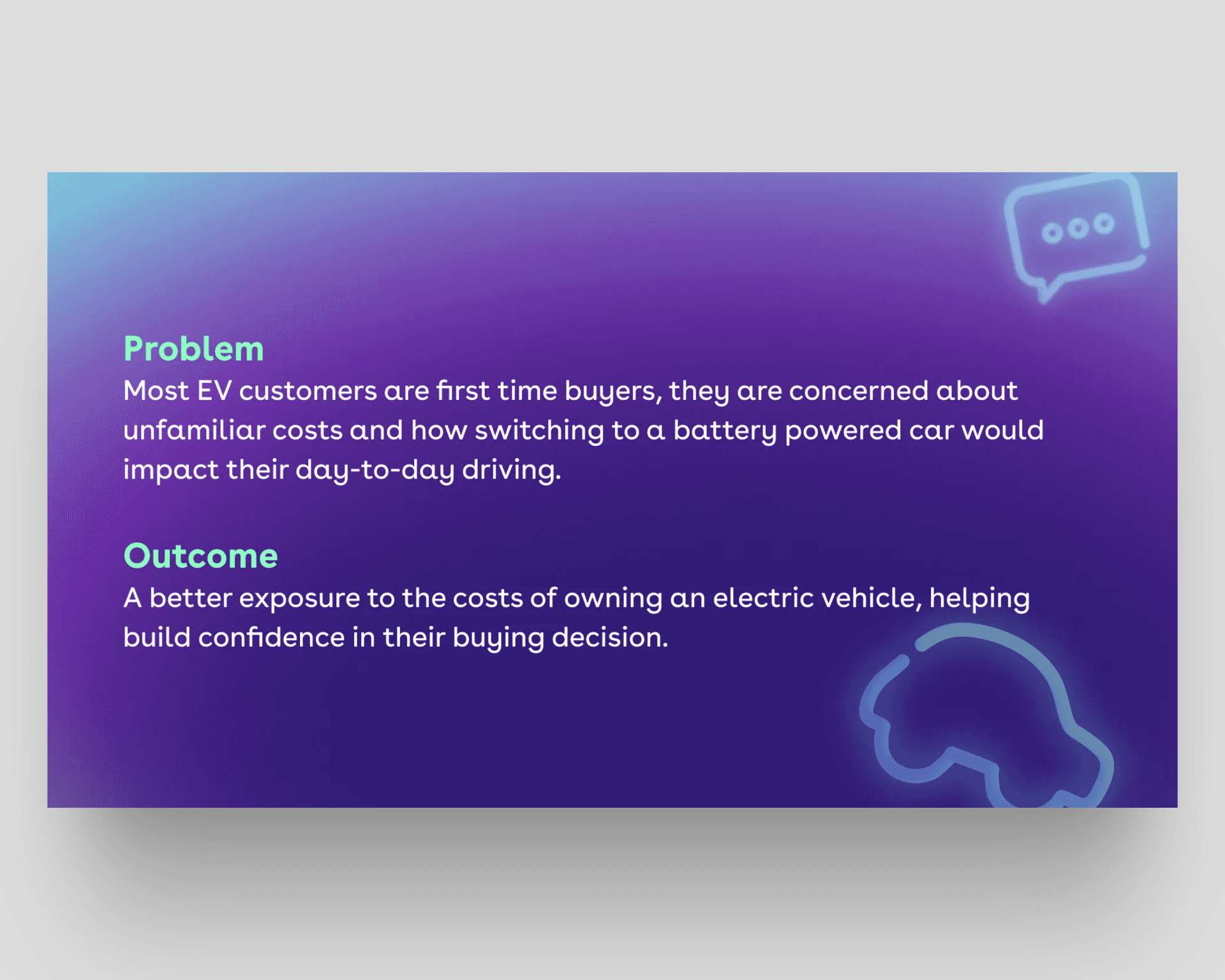
Framing the problem we were trying to solve.
Balancing education with conversion
We considered standalone EV guides, but embedding education directly in the product page avoided fragmenting the journey. Progressive disclosure was used to support understanding without turning the page into a dense educational resource.
Customer support teams highlighted repeated EV related questions, helping prioritise the most impactful knowledge gaps to address.
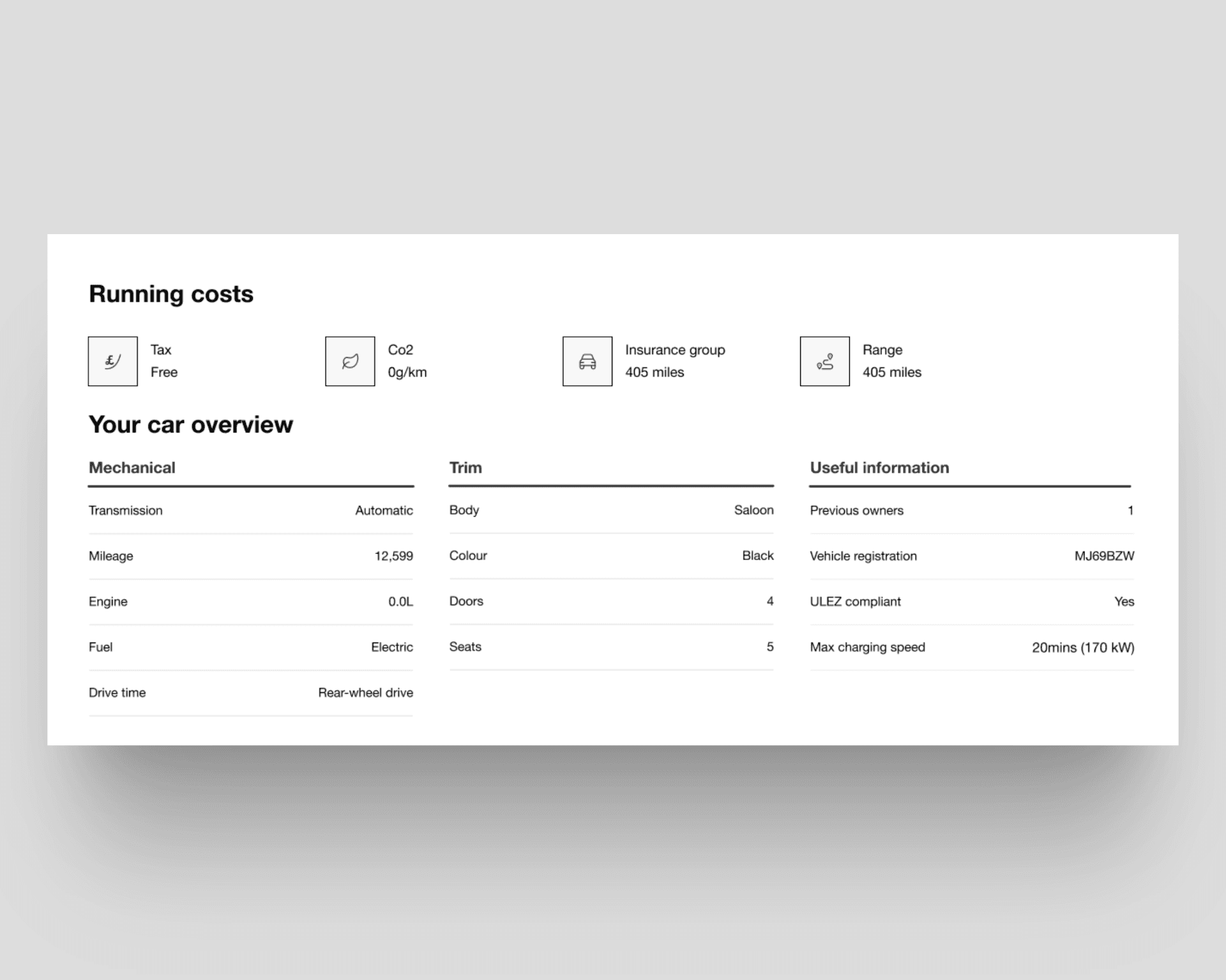
Testing of early wireframes showed users needed more education on range and running costs.
Outcome
The updated EV pages made range, charging and running costs clear at the point of decision, without turning the page into an educational resource.
Internal stakeholders noted the pages better supported EV positioning and reduced the need for basic EV clarification during later sales conversations.
Key learnings
Uncertainty is a major barrier in emerging product categories
Educational content is most effective when integrated into the decision journey
Progressive disclosure helps balance clarity with conversion focus
What I would do next
Future work could introduce comparison tools and cost of ownership calculators to support deeper evaluation and decision confidence.
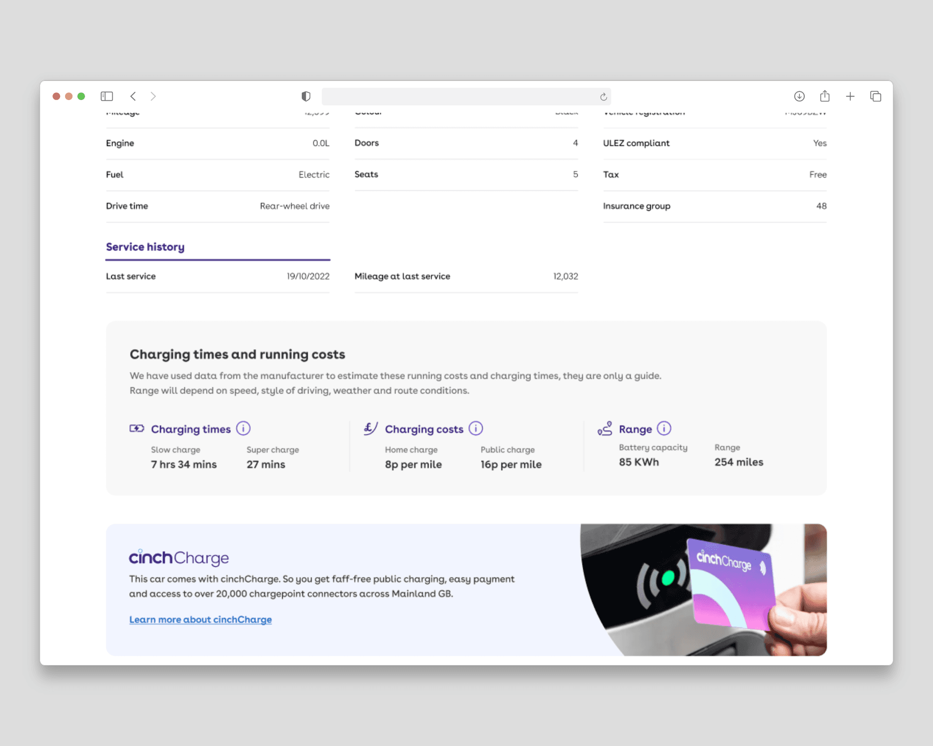
New component shown on desktop.
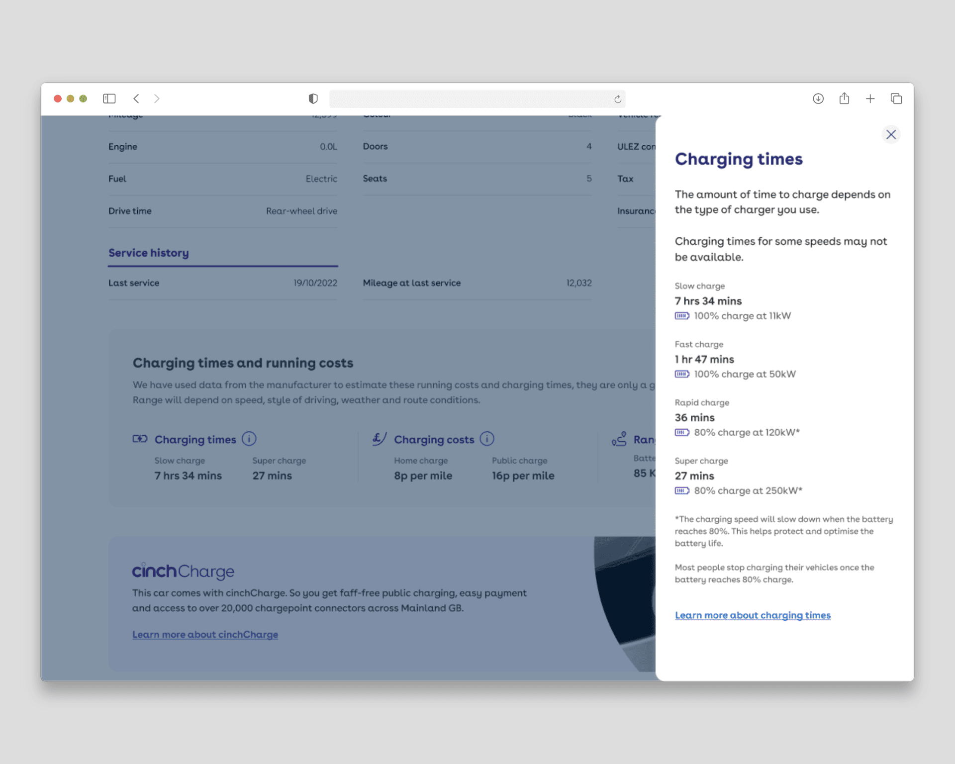
Each drawer offers educational content to build confidence and understanding.
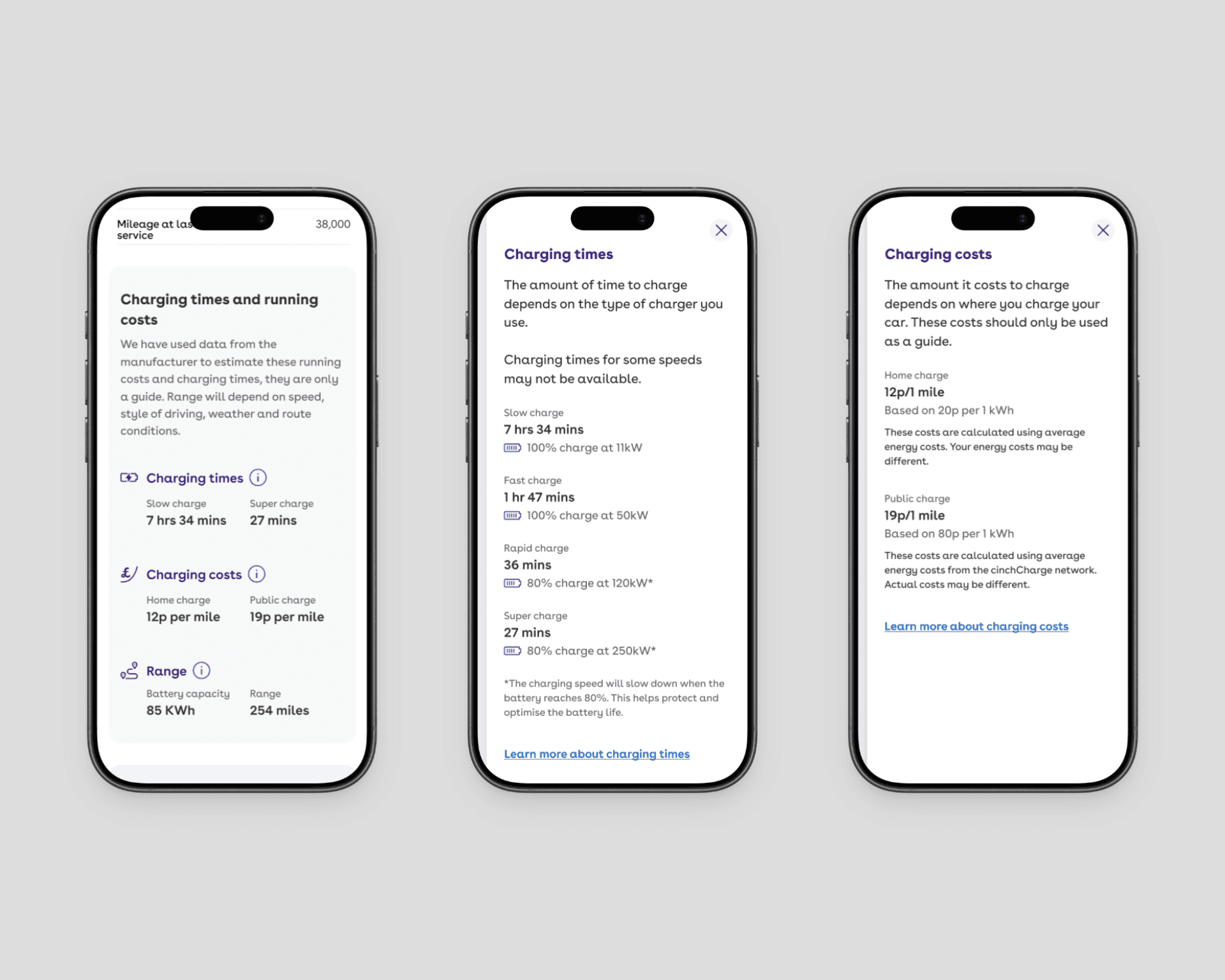
Mobile views showing new component and additional drawers.
Other projects

AI Search Experience
Shaping how AI search fits a car buying journey where most people already know what they want.

Luxury Platform Launch
Launching a premium car buying experience within platform constraints and brand expectations.
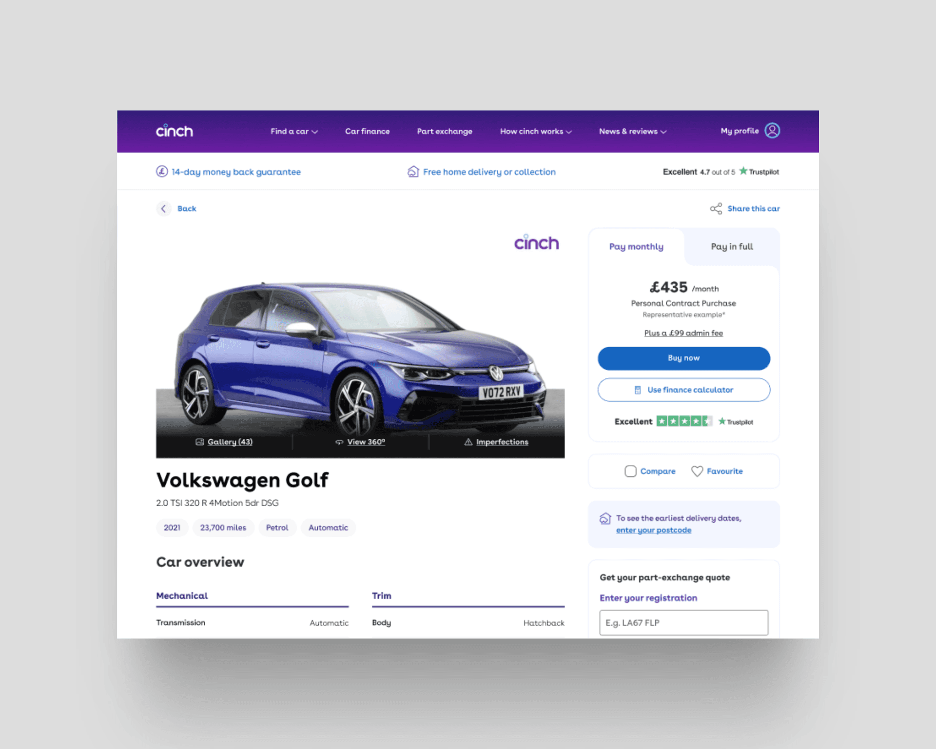
Product Page Optimisation
Improving purchase intent through clearer hierarchy, stronger decision cues, and experimentation.

Design System Alignment
Restoring design and development alignment to improve consistency and delivery efficiency.